I have been inspired a lot by the contemporary user interfaces and graphic design with bright colours, bold fonts, gradients and either angular or flowing lines. I have started developing the visual side, taking into account the results from the cultural boards, in which most people preferred flat colours over lots of lines, and a bold style over more delicate or round ones. The goal for the visual side of the application is making assessing things easy. I want the branding to stand out, yet still be friendly and approachable for the users.
The following are some of my font combination iterations:


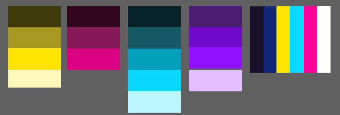
I created some colour palettes and asked people from my target group feedback on them, resulting in more iterations:

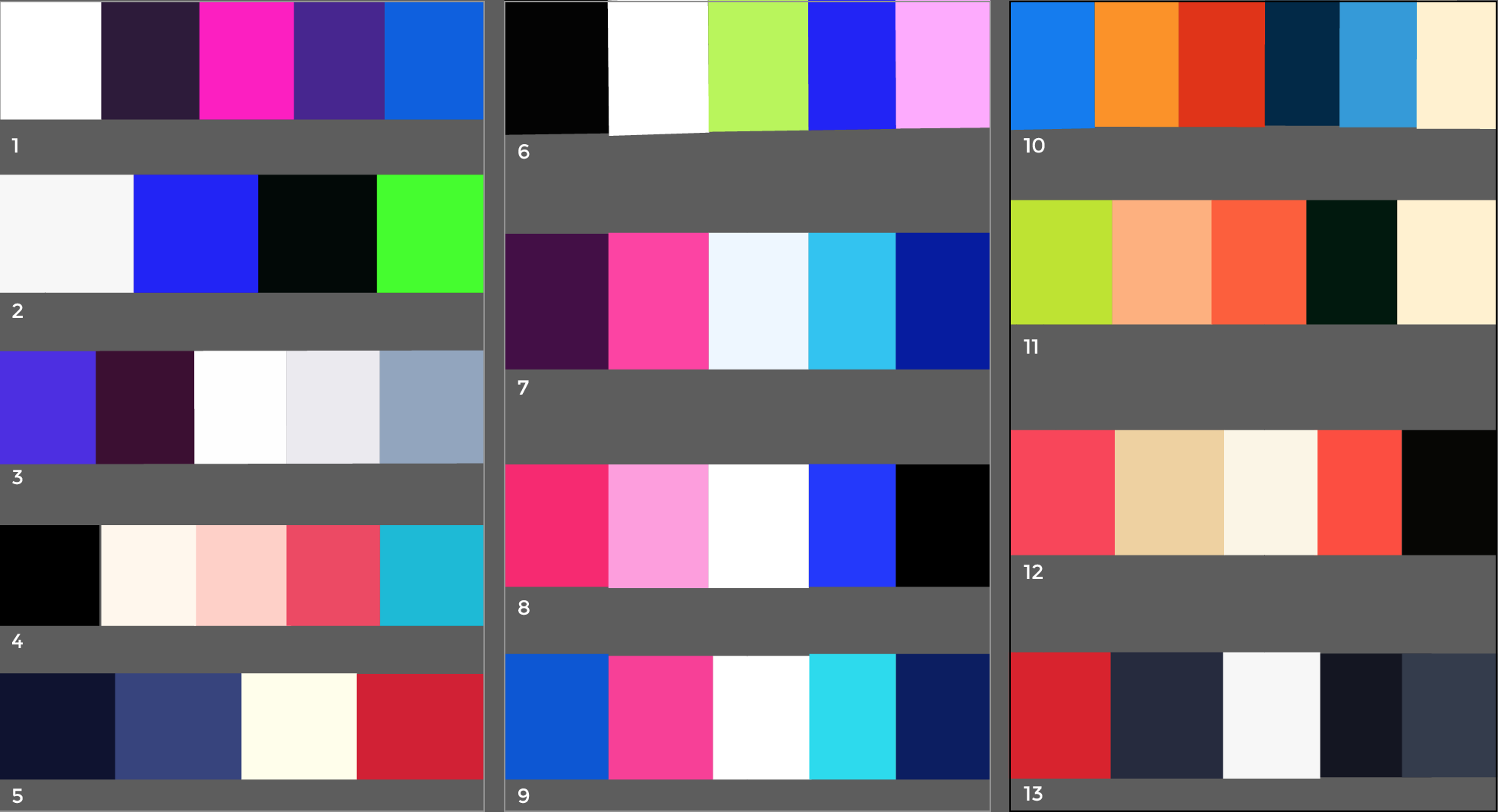


I also experimented with the layout design and tested different kinds of colour palettes to see which ones would be readable and suit the tone of the application. I asked people to pick their favourite ones and iterated them further:


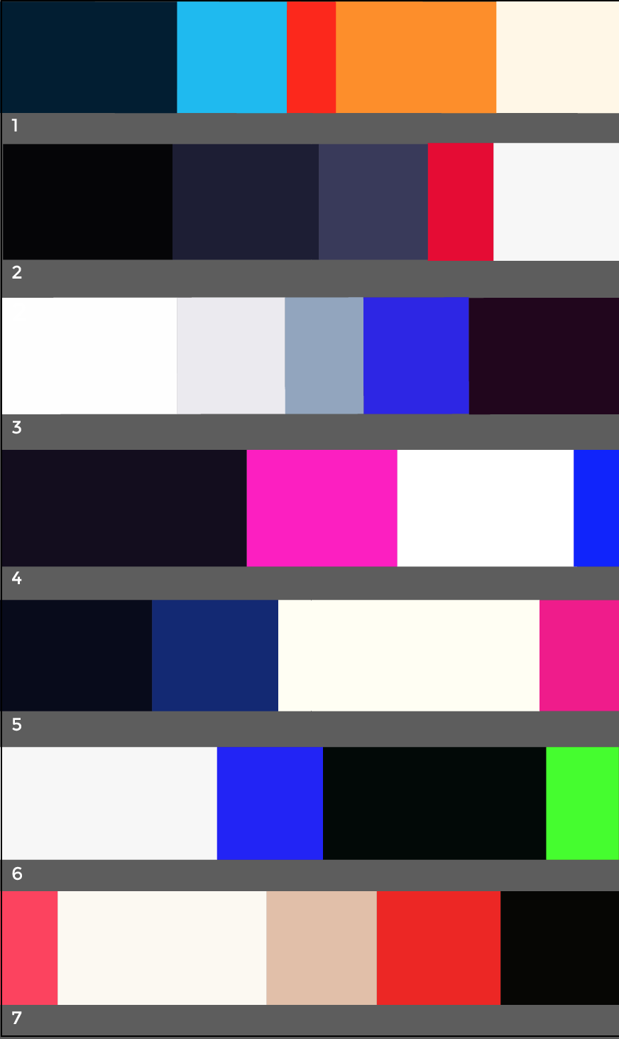
The one I chose to develop forward was the palette with gray, pink and yellow, as I personally thought that would be the best fit for the UI. The palette is not too vibrant but also not too monotonous.
I also discarded the idea of changing the colours when the prompt path progresses, as I believe it is better to maintain a consistent brand throughout the app. This also removes the pressure to complete a path in order to feel accomplished.


Layout iteration for Mark1 prototype
