For my Mark 1 prototype I had two goals: to have one set of exercises to prototype how it feels to interact with the different assets, as well as to add some colour and visual iteration to test how the palette works in the UI.


Before MK1 I asked some more feedback on the social side of the application, and a lot of people said that seeing other people’s work-in-progress art would help with their insecurity, as they could see that others have “bad” drawing days or stages too. I think keeping the social side limited within the app is more beneficial for the target group than connecting it to others, as other social medias suffer from the saturation of good work that creates insecurity and pressure to post only finished images. Social side within the app would allow the users to post even their “bad” or unfinished work within a safe environment, as the social community side wouldn’t have a follow or a like system.

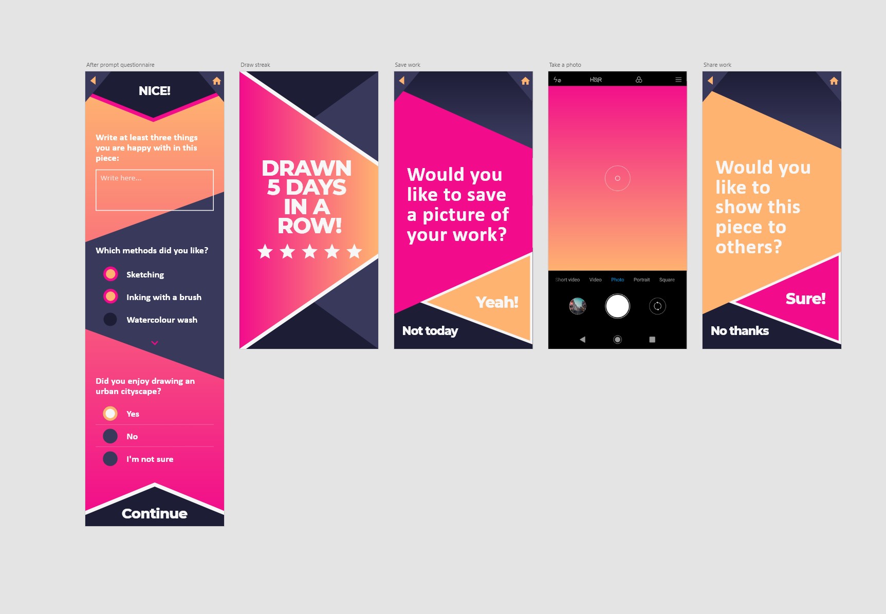
Next I will continue iterating the branding and information hierarchy of the application. I got feedback that writing after each drawing stage breaks the flow of the application, so I will explore other ways to allow the user to mark what they like in their work at that stage. One of my ideas is having the user to take a photo of their work after each drawing stage, and the application assembles a gif animation of their work so far. The animation is displayed for the user after each prompt stage, in their own progress gallery and in the community side to others. When looking back at the user’s own previous work, this would also demonstrate in a positive way how much the user has accomplished.
Some other feature fixes I will add are some guiding details such as descriptions to explain each prompt type, and having an option to take a photo of the user’s progress whenever the user wants, but at least once after each drawing stage to assemble the gif animation.
After presenting the Mark 1, I also asked people to actually draw the prompt path and provide feedback on that. Some of the user testers were same people as the ones that tested the previous version of the prototype. The feedback was mostly positive on how the tone of voice is now more welcoming, and the prompt path structure works linearly. However, the curriculum and schedule got mixed up, and the curriculum didn’t make much sense to the testers. I got many comments similar to “the curriculum feels rigid, it’s not what I want”, as the focus of the app shifted and felt too school-like. Therefore I’m thinking of removing the curriculum, and focusing on presenting the goals in a clearer way as a part of the user’s own progress. After all, the application uses the user’s goals to suggest suitable prompts they might like or find useful. The interaction felt natural but at times sloppy due to it being just a prototype. The application does seem to succeed in its main goal – to return the joy to drawing. One person who tested the prompt said he never draws backgrounds, but the app guided him enough with the supporting materials and allowed him to focus on having fun with drawing instead of having to Google for perspective grids. “The app makes it easy to focus on relevant things without having to think too much.”
