I’ve been defining my project goals – the aim of this application is not to teach people how to draw, but to get people to draw and engage with the drawing practise regularly, and to shift people’s thinking and attitude towards their own work. Because the amateur artist’s mind is stuck on negative thinking patterns, they fail to evaluate their own work and often lack a healthy form of self-criticism. That negative outlook discourages people from drawing as they feel that they don’t have the ”talent” for it.
My project aims to promote a growth mentality, helps to find the positive qualities of one’s own work and assists in finding and setting informed goals to work towards.
When it comes to the actual functionality of the app, I took some inspiration from other self-help, tracking and scheduling apps. However, instead of this being just a ”get up and do it” application, it is important that this is more towards ”assisted get up and do it”.
It is really important to focus on the positive side and the improvements and achievements, so I looked into how applications use streaks and reward the user of their work. I believe including congratulations such as ”you’ve drawn for three months now!” or ”you’ve drawn 5 drawings!” is beneficial for the user. An example of this is Pokemon Go – distant to my subject, but relevant int terms that the app congratulates the user on the weekly streaks, but doesn’t shame them for breaking the streak. Instead it just starts again from day one. I find staying away from the kind of ”streak broken” remarks is important in order to not to discourage the user.

As the application needs to stay engaging in the long term, it is important that the visuals are inspiring and that the phrasing of the texts is supportive of the user’s goals. That’s why I have looked into creative branding and colours, and also into existing lifestyle apps to avoid the kind of pressuring likeness to productivity and to-do apps.
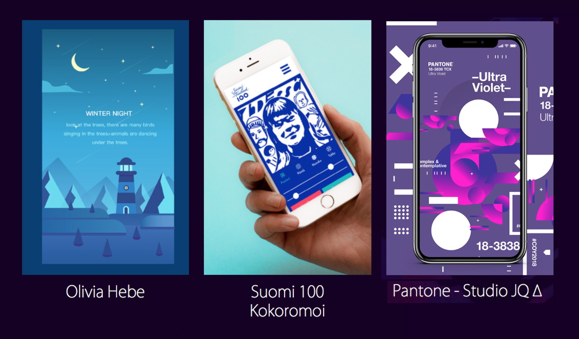
I feel like these will help me to find a visual direction for the application and make the app more engaging from just the kind of text-on-background type of thing.

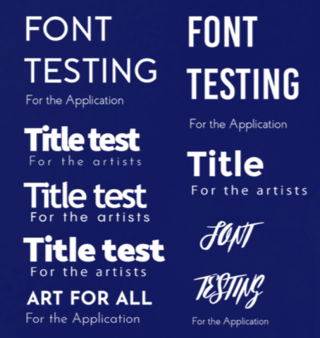
Inspired by this I have been exploring with different colours and typography options.
