After Mark 2 I gathered more feedback on the prototype. People described the visual style as friendly and inspiring, and I’m happy that it meets my goals on that. I have changed the colour palette slightly towards a more uniform, colder palette, as well as smoothed out the organic shapes, as people preferred them more. I also changed the drop down menu designs to less cluttered ones, while still keeping the paint splash elements in most button press options.
The prompt path structure got a positive response, and now the focus is on smoothing out the interactions with some in-between animations and iterating the graphic design to create a better information hierarchy.
The word cloud in the home page was too distracting and messy, so instead I created a small statistics page that shows “what’s in” using a few key words. The page shows the user’s own current top tags for their own work, as well as others’ top tags for the user’s work. The page also has an option to change the user’s goals within the application, thus changing the recommendation preferences for the prompts. I have also added more in-between animations and welcome screens.
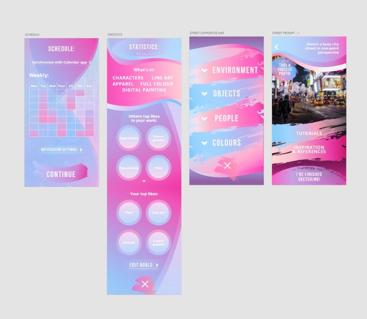
Additionally, when the user browses someone else’s work in the community gallery, they can now see the difficulty of the prompt the drawing was based on, some key words describing the prompt as well as an option to take the same prompt if they are interested and inspired.
I have also thought about aligning the images for the gif and come to conclusion that with digital imported images that can be easily done. With photographed drawings the application could use corner alignments or image recognition to smoothen the animation. Then again, even if the photographed images would be skewed or from an angle, as long as the user can see their own work they will be able to tag the parts they like in it.
I also thought how the tags would be visually displayed without being cluttered when the user gets multiple tags from other users. As the point of the tags is to provide an overall visual cue of what others like in the work, one way could be showing a fading animation of different tag clusters at each stage, that the user would then be able to tap open. However, due to the limitations of ProtoPie and the time it takes to assemble the interaction for each of the tagging circles, I am not able to demonstrate a full changing animation of tag clusters in this prototype.
Other limitation is in remembering the user’s tags at each stage – as ProtoPie does not support any kind of temporary memory system, the prototype is not able to remember what the user tagged live and then display the same tag in gallery or in the process timeline. I will create an example of the user added tags and comments for the progress timeline and community, and still have the free tagging interaction after each stage to demonstrate how the interaction feels.
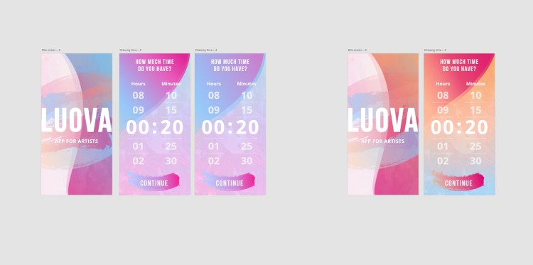
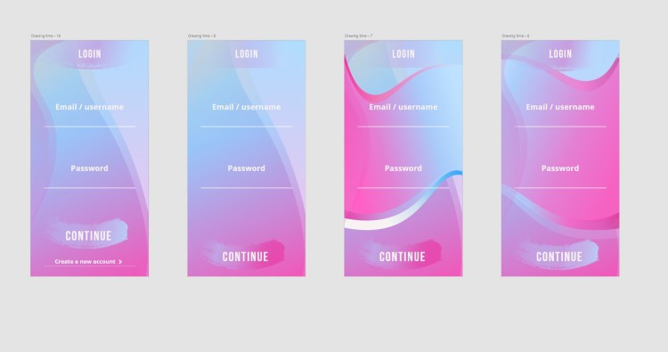
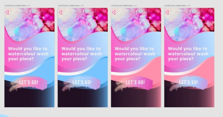
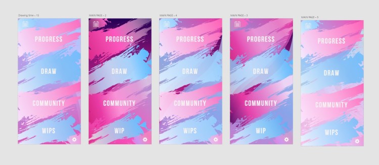
Here are some screen iterations for the final design:


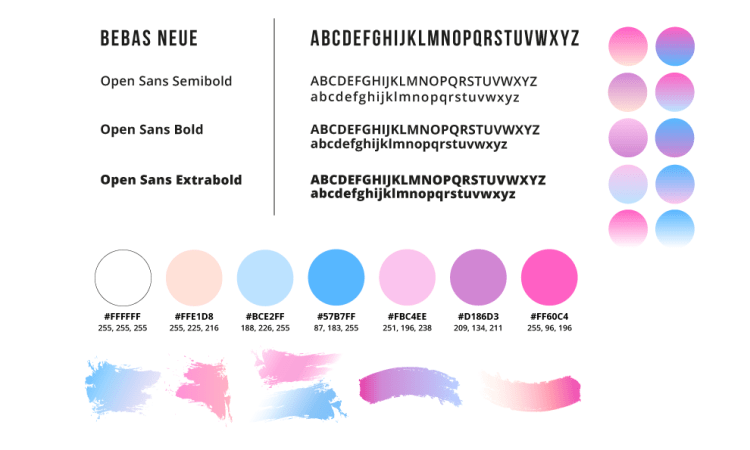
The design guideline for the final prototype: