


Design iterations


Mark 2 Design approach
Here are some new iterations of the branding and the visual side of the application. The previous angular design did not complement the UI elements and made the application harder to navigate, so I changed the visual direction to more organic with round lines. With only flat colours the palette was a bit too overwhelming, but it works with gradients and as a slightly toned-down version. As I want the design to reflect the theme of the app, I’m testing how paint splashes work as graphic design elements. However, the palette and design are not quite there yet, so I will continue iterating on them. I’m also thinking of details such as showing people “what’s in” in the home screen, consisting of key words on what the user has been drawing and enjoying the most lately.
I have also decided on a final name for the application: “Luova”. Luova is a Finnish word that is used to describe a creative person. Luova is short and snappy, and I think it fits the theme of the app.

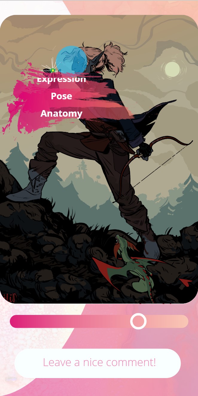

I have also asked for feedback on the social side of the application to determine which direction I should take. It seems to be a popular idea, so I thought of applying the tagging interaction to the community along with the process animations/gifs. In the community side people can add what they liked about others work as quick tags. Tagging is a more effortless way to leave a comment compared to the effort of writing. These tags would then be displayed to the user if they browse their own old published work, and maybe also as visualised statistics. Some people mentioned that they would like to see “meaningless statistics” as long as it stays positive and doesn’t become too pressuring.
People often comment each other’s work in similar ways, such as “nice face” or “great line art”, which is easy to replicate with the tags. It also provides a set of nice visual data when looking at the image and its tag clusters at different stages of the illustration.
Some further feedback I got was that instead of just tagging, maintaining the open written field is something the user testers found important. Whereas tags are time efficient and an easy way to communicate something positive, written comments add a personal touch and let people to explain more complex nuances.
I did consider a direct critique tag, where the user could mark what they didn’t like and would need more help with in their drawings. I then discarded the idea after asking some opinions, as people from the target group explained that they do notice the negatives in their work, and if the app allows them to tag negative things, they will have even harder time thinking positively about their work. The direct critique tag could be useful if the user is really focused on improvement, but personally I’ve come to decision that it wouldn’t fit the tone of the application and the needs of the target group. They would prefer the indirect approach of focusing on the positive, as they struggle in finding the joy of the drawing process and the strong parts in their art.
I also considered a system where the application would notice which tags the user doesn’t get as often, and change the prompt recommendations to reflect that and provide more prompts with the subjects or media the user needs to improve on. However, within the time limitations and prototype limitations it would be difficult to test the results of that, and within this context it seemed irrelevant, as the focus of the application is not in teaching improvement. Additionally, the goals already provide an opportunity to customise the prompt suggestions, and I believe maintaining the user’s own agency in determining the goals is more important than hidden changes. The interviewed people mentioned that they would notice if they get a lot of “line art” tags but not “colour palette” tags for example, and that having the option to change the goals within the application towards more prompts that feature practising a colour palette is enough if the user has the desire to improve on that. However, it should not be forced, as that doesn’t suit the premise or tone of Luova.

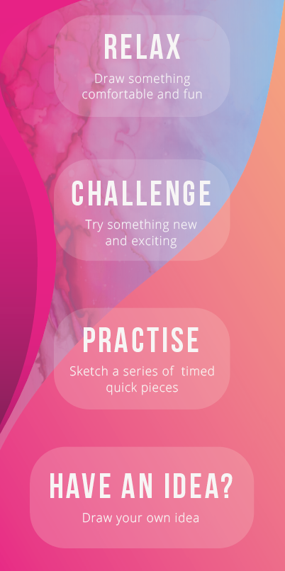
I iterated the community side a bit as well as added a featured “daily prompt” slideshow in the gallery, along with a link that directs to that prompt path. The user can do the daily prompt and have their work featured in the daily prompt slideshow, which would provide a sense of community while still staying light-hearted. As the point of the application is to avoid collecting followers and likes, I have chosen not to include a following system to the community side, but to showcase the artwork based on different categories. In addition to “recent” the community has a filtering system based on prompt types such as “relax” or “challenge”, as well as prompt tags – drawings with a lot of tags on “line art”, for example, would be displayed when the user chooses to filter based on the “line art” tag.
The community side will include the artist’s name so that people can find them from other social media, but it will not have follow system. This ensures that the user is exposed to a lot of different artworks and not only the few artists they look up to, thus expanding their view on how different each person’s drawing process is.
As a small detail, I removed “your work” from the community side. It was unnecessary since the user can browse their work through their own progress timeline, and I will add highlights to display the published images in the user’s own progress timeline, as well as the user’s own images in the community timeline.
